
Food Photography Backgrounds: 12 Practical Backdrop Ideas
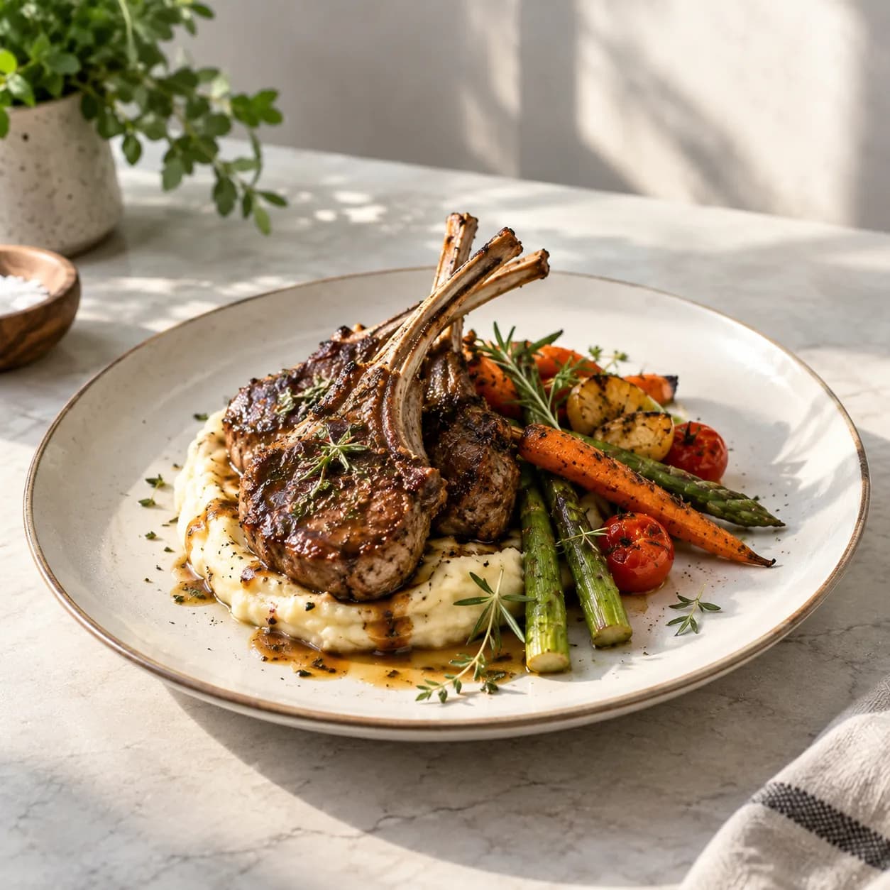
The best food photography backgrounds support the dish without competing for attention. They provide contrast, reinforce the restaurant’s style, and make a full menu feel consistent. You can build an effective setup with a table, a portable backdrop, and a few inexpensive materials—no permanent studio required.
This guide explains which materials work, how to choose a color, and how to avoid reflections, stains, and visual clutter.
What makes a good food photography background?
A useful backdrop should meet four requirements:
- Low glare: matte surfaces are easier to light than glossy ones.
- Enough contrast: the edge of the plate and food should remain visible.
- Easy cleanup: restaurant shoots involve sauces, crumbs, condensation, and oil.
- Repeatability: your team should be able to recreate the look next week.
The background does not have to look expensive. It needs to look intentional.
Choose a background that works for most of your dishes. A beautiful surface that only suits one plate creates more work than a simple backdrop you can use across the entire menu.
12 food photography background ideas
1. Matte white
White creates a clean, bright result and works well for delivery listings, bakeries, beverages, and colorful dishes. Use an off-white or softly textured surface when pure white feels clinical.
Watch the edge of white plates. Add a pale gray board, napkin, or subtle shadow so the plate does not disappear into the background.
2. Light gray
Light gray is one of the most flexible food photography backdrops. It keeps the scene neutral, provides separation from white tableware, and works with both warm and cool food colors.
3. Charcoal
Dark gray adds contrast to pale food, cocktails, desserts, and premium dishes. It is easier to manage than pure black because it retains visible texture in the shadows.
4. Natural wood
Wood suits cafes, bakeries, barbecue restaurants, pubs, and farm-to-table brands. Select a grain that is visible but not so strong that it competes with the food.
Avoid orange varnish and glossy finishes. Both can reflect the light and shift the apparent color of the dish.
5. Stone or stone-look board
Stone gives product and restaurant photos a polished appearance. Real stone is durable but heavy; printed or hand-painted backdrop boards are easier to move between locations.
6. Brushed metal
Stainless steel can support an industrial kitchen, seafood, cocktail, or modern restaurant concept. Control the reflections with a large diffuser and keep the surface spotless.
7. Ceramic tile
Individual matte tiles are affordable, washable, and easy to replace. Use wide tiles with narrow grout lines so the pattern does not break up the frame.
8. Seamless paper
Paper backdrops are useful for overhead shots and clean product-style images. They are available in many colors and can be trimmed when stained. Keep them away from wet dishes and condensation.
9. Painted plywood or MDF
A painted board is one of the most practical DIY food photography backgrounds. Choose a washable matte paint and apply color with a sponge or roller for subtle variation.
Seal the finished board with a matte, food-safe finish if plates or utensils will touch it. Do not place unwrapped food directly on a craft surface.
10. Linen
Linen adds softness and movement to breakfast, bakery, and rustic scenes. Steam or press it before the shoot, then create only a few deliberate folds. Random wrinkles look untidy at thumbnail size.
11. Parchment or kraft paper
Paper works well for bread, pastries, sandwiches, and casual takeaway food. Replace it between dishes when grease marks become distracting.
12. A real restaurant table
Sometimes the most authentic background is already in the dining room. Use it when the surface supports the brand and the surrounding details can be controlled. Remove table numbers, cleaning supplies, cables, and unrelated dishes before shooting.
How to choose the right background color
Match the restaurant’s visual identity
A bright cafe may suit pale neutrals and warm wood. A cocktail bar may benefit from charcoal or deep stone. The backdrop should feel related to the space even when customers only see a menu thumbnail.
Create separation from the food
Use contrast in brightness, color, or texture:
- Pale pasta stands out against charcoal or warm wood.
- Dark chocolate desserts separate well from a lighter neutral.
- Green salads can look fresher against stone, gray, or warm neutral surfaces.
- Colorful bowls often need a restrained background rather than another strong color.
Keep food color believable
Strongly colored backdrops can reflect onto white plates and light foods. Red, green, and blue surfaces are especially likely to create a color cast when placed close to the dish.
Backgrounds for different channels
Restaurant menus
Use one or two neutral surfaces across the menu. Consistency is more important than giving every dish a unique set.
Delivery apps
Choose simple backgrounds with clear subject separation. Leave empty space around the plate so square, portrait, and landscape crops do not cut off the food. You can check a finished image with the delivery app photo checker.
Social media
You can introduce more props and seasonal colors, but keep the food as the clearest element. Our social media food photography guide covers channel-specific compositions.
Packaged food
Match the surface to the product positioning while keeping labels readable. A natural snack brand might use pale wood or linen, while a premium product may suit stone or a controlled color sweep. See the packaged food photography guide for product-focused examples.
How to build a two-board backdrop
A two-board setup lets you photograph at 45 degrees without showing the rest of the room.
- Use one board as the table surface.
- Stand a second board behind it.
- Leave a small gap or overlap the boards so no bright line appears at the seam.
- Move the dish away from the rear board to soften its texture.
- Use a wider aperture or portrait mode carefully to reduce background detail.
For a seamless look, curve a sheet of paper or vinyl from the vertical surface onto the table. Do not crease it where the two planes meet.
Common background mistakes
Too much texture
Heavy grain, large marble veins, and busy tile patterns can compete with ingredients. Take a test photo and view it at menu-thumbnail size. If the surface attracts attention first, simplify it.
Glossy reflections
Reflections can reveal lights, windows, and the photographer. Use a matte surface or change the light angle. Do not rely on editing to remove dozens of highlights across a full menu.
A different background for every dish
Variety can work in an editorial campaign, but it usually makes an ordering menu feel inconsistent. Standardize the main surface and change only small supporting details.
Props without a purpose
Loose herbs, cutlery, napkins, and ingredients should explain the dish or frame it. Remove anything that does not improve recognition, appetite appeal, or brand context.
Unsafe materials
Craft boards, paint, and printed vinyl are not automatically food-safe. Keep food on plates, trays, parchment, or another approved barrier.
A simple backdrop kit for restaurants
Store a small repeatable kit near the shooting area:
- one light neutral board,
- one dark neutral board,
- white and black foam boards,
- neutral linen,
- removable tape and clamps,
- microfiber cloth,
- parchment paper,
- a reference image showing the approved setup.
This kit covers most menu, delivery, and social content without turning the dining room into a studio.
How AI fits into the background workflow
Use a physical background when you need guaranteed realism, exact brand materials, or repeatable reflections. Use AI food photography when the source setting is cluttered, locations have different surfaces, or you need multiple clean visual directions from one usable dish photo.
The source image still matters. Keep the dish sharp, avoid covering its edges with props, and photograph it from the intended final angle.
Food photography background FAQ
What is the best background for food photography?
A matte neutral surface—light gray, warm white, charcoal, or subtle wood—is the safest choice for a varied menu.
What can I use as a cheap food photography backdrop?
Painted board, matte tile, parchment, neutral linen, and seamless paper are affordable options. Choose materials that can be cleaned or replaced.
Should the background be light or dark?
Choose based on the dish and brand. The food needs enough separation to remain clear at small sizes. A menu may use one light setup and one dark setup for flexibility.
Can I replace a food photo background later?
Yes, but clean edges and a sharp source image make replacement easier. Photograph against a simple surface and avoid objects crossing in front of the plate.
Give every menu photo a consistent setting
Use PlatePhoto to clean up distracting surroundings and create polished food images with a cohesive visual style.
Read Next
Continue exploring our latest guides and tips
Bread Photography: 10 Tips for Bakery and Cafe Photos
Photograph bread with crisp crust, visible crumb, and natural color. Follow this bakery-friendly guide for loaves, slices, pastries, and menu images.
Read articleFood Photography Lighting: A Practical Setup Guide
Learn simple food photography lighting setups for restaurants, from soft window light to a repeatable one-light setup for menus and delivery apps.
Read articleBreakfast Photography: 11 Tips for Cafe and Brunch Menus
Create bright, appetizing breakfast photos for cafe and brunch menus. Learn how to style eggs, pancakes, coffee, pastries, and full breakfast plates.
Read article